Thank you for visiting my blog, my name is Laura Adams and I am currently in my final year studying graphic design. I'm using this blog to keep people updated with my work, enjoy!

Thursday, 23 December 2010

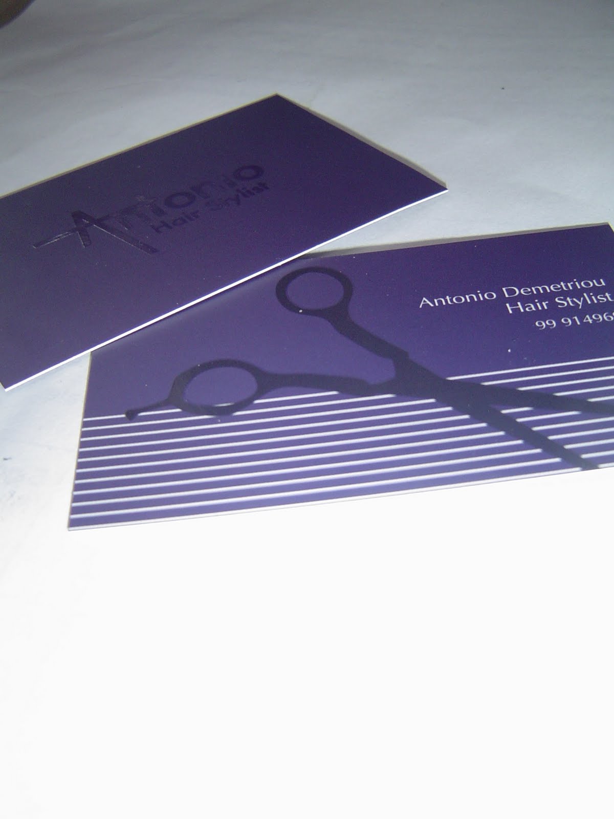
Antonis Demetriou


Finally got these bad boys printed a month ago using solopress, the turnaround and quality of this printer was great, I really recommend these guys to anyone looking to print! Also sent me a nice pack of all the examples that they print on to, really nice design on that too! It's a really great feeling to see your work printed for the first time - and an even better feeling to have a satisfied client! :)

Thanks Antonis!

Meanwhile.. i've been getting a lot of work done lately! Got 5000 words ready for my 4000 word deadline when we go back to uni in jan, pretty happy with my designs for the photography exhibition brochure and working on a magazine client project with Rhys at the moment! Things are happening!

Unicorn.Feathers

Thursday, 18 November 2010

Pure Nothingness!

So! after handing in the two (only two we're given in our third year) university briefs two weeks ago and a 2000 word draft of the dissertation a week ago! I found myself feeling very very alone.. HOWEVER, really excited to be free to do my own things! So far I've written two personal briefs and whittled my client briefs down to two for the moment. Both have been approved by the tutor, with praise, and so I need to get cracking before the Viva.

I only wish I didn't need to work each weekend, I'd have alot more time to crack this design business. I'm just going to become a hermit within the week and not leave my mac alone!

I'm not giving any ideas away for my briefs yet, not until I have some visuals to put up here to explain things a little better!

I need to find my personal fuel - don't drink tea or coffee.. energy drinks don't seem to do anything.. and I live of sweets so sugar won't work. suggestions on a postcard?

Unicorn.Feathers

Tuesday, 9 November 2010

Packaging Project

Over Summer we were given a packaging project. To go into a supermarket/DIY store and choose a product that has a set of three to redesign. The existing packaging had to be really poorly designed in our opinion. Firstly I chose the value range of paint in homebase, even the next level up of quality homebase paint was poorly designed. Does anyone really want to see a woman sat in a painted room on their tin? More of the colour swatch should have been visable...

However, I decided against this idea as the project was to last me over the summer period.. I didn't want to get bored! So I decided to do something that I buy regularly, I settled upon Doughnut packaging. The bad packaging culprit was ASDA, I recognised the bag for the doughnuts has been chosen as the doughnuts are made in store and are bagged when made. However, there are weird 'doughnut' shapes squirting juice on the bags which have a weird orange/brown colour printed on to the bag. The label also left design to be desired.

So! enough bitching about the ASDA doughnut packaging... here's my idea!


The top section of the label is reversed so that when folded over the brown paper bag to seal it the label will be facing downwards. I kept to a paper bag for ease of packaging shipment and bagging in store. However, i kept to a plain brown bag because I feel that it gives the bakery brand a homemade feel.. much like the logo I produced for the bakery.

My idea for the small symbol illustrations for the doughtnuts came from an original idea wher I drew a line of four for each confectionary product. I developed this and feel the idea could be spread across the whole confectionary section of the bakery. Below is the idea on cupcake labels, which would be stuck on the plastic packaging currently used. For more gourmet cupcakes I am thinking of developing a box myself for a personal project. I'll keep you posted!


Unicorn.Feathers x

Wednesday, 20 October 2010

Client Work

Catch up!
Throughout summer I made a dedicated start on my progress towards third year! as well as having a holiday and a life..

So here are a few client projects I did over my summer and carried on into my first semester back in Swansea.


My first Client brief was from a lady wanting to open a Hair Salon in Cyprus, the salon would be called XTC and the colours had to be vibrant green and purples. Other than these requirements I was left to my own devices. Below shows how the logo can be adapted to suit other needs or colour requirements.


Next, my local scout group approached me as they wanted to get their own version of the scouting logo produced for their uniform, neckers and any other material they would use the logo on. They gave me colour requirements and showed me the original welsh scouting logo. I showed them a few ideas, and this is what they chose.


A Hairdresser approached me to make business cards for him to use when doing freelance work or networking with potential clients and customers. There was no brief set, I created a few different samples and showed the client, below is the final business card.


My latest complete client project is for Crow Valley Line Dancing, a line dancing company based in my home town of Cwmbran. I produced a logo for the company as they had never had one before. I was only briefed on colours, through research I found myself coming to the solution shown below and the client is now using this logo.


I have two other Client projects on at the moment, as well as two university briefs and my dissertation. However, I'm always looking for new work and more experience. If you know anyone who I could help with some graphic design knowledge or work, please don't hesitate to contact me! limelor@msn.com

Wednesday, 28 July 2010

Our final major project of year two of the course! Make the 'Uncool' cool, each person in the class was given a different uncool hobby, mine was badminton! Which I found particularly hard as all the research I found led me to believe Badminton is really popular! However, I did find statistics which told me the number of younger players are decreasing!

So this was my solution! Posters showing all different ages enjoying the game, I created the logo, photographs and poster designs. As well as designing collectable shuttles for children, the idea being they would be sold in shops to attract a much younger generation and hook them to the game!


Tuesday, 27 July 2010

Book Design - Sins and Virtues


An illustrative book. Showing my sins and virtues within the field of design.

Unicorn.Feathers

Visual Studies - Experimentation and Graphics!


If you haven't spotted the deliberate mistake already! the logo on the last poster is wrong, but I can't find the final edit!

We were given eight random words, mine included, dinosaur and black hole. From these eight words we could create anything, this was our first project of second year. It was to get our imagination going, and our experimentation within graphic design back on form. Many briefs through graphic design specify the exact requirements/measurements/specifications and leave very little room for experimentation so this project was great! I designed three posters for children's adventure holidays including the logo for the company so the posters looked more authentic! I found illustrating the characters very difficult, but with practice I think I could get better!

Unicorn.Feathers